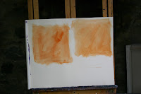
 I am hoping to get into the city to do some plein air painting. I think it is important to have some idea how we will approach a scene when we are out there. There are many ways to start a painting. We can do a monochrome value study, draw it in, or block it in and paint from there. In my "Plein Monitor" painting, I chose to block in with thinned paint and a large brush and work from there. I kept to a limited palette of ivory black, viridian, yellow ochre, cad red, and white. (I often use this for rainy scenes). I also worked from a black and white photo to get my values right. (I won't be able to do that out doors).
How do you approach a painting? I would love to hear some thoughts and opinions.
I will be doing the other 8 x 8 in a less limited colour palette and will post that one shortly.-001.jpg)


5 comments:
Thank you for sharing the colours of your palette! I for one, will make a note of them. All the best with your outdoor work, Catherine!
Hi Catherine,
Each painting is different. So much depends on the subject matter, whether it's from photos or a live subject or still life. I start with a ground on canvas, and then draw on the ground. Then I build up more
coloured grounds depending on my mood, and take off.
Love what you do.
XOXO Barbara
I got a chuckle out of your term "plein monitor"! I am asking myself how I start a painting. I tone the canvas and draw in the basic shapes with thinned paint. I don't "block in". After the drawing I follow my instincts depending on the subject, which is why I don't really know what I do. Apply paint and leave it alone, I guess.
Thanks Karen and Barbara for your comments! I like that you are both instinctive. I should try that more often.
Hi Catherine,
I like your works, they are great. Thanks for sharing your art with us.
Every painting "tells" me how to approach the painting process, which is mostly intuitively, although I also do draw the outlines with the brush to give me the right proportions. But that depends on subject matter.
When I read about your palette I thought to share what palette I use. I like to work with a limited palette. The colors I use are Cadmium Yellow Pale, Vermillion (warm red), Alizarin Crimson (cool red), Ultramarine Blue (cool), Cerulean Blue (warm), Phtalo Green (cool) and Titanium White.
I do not use any "black" colors as I find that an equal amount of Aizarin Crimson and Phtalo Green makes a rich "black" tone that has color in it. When I want to use a "warm" grey, I add a bit of Cad Yellow to the it. As you might know, white cools any color. By adding Yellow, I warm the tone.
Depending on what sort of black or grey I need, I add Ultramarin Blue, Alizarin, Cad Yellow or Phtalo Green to it.
Anyway, you can read a bit more on my blog if you want.
Kind regards
Michael Sason
Post a Comment